This tutorial presents a simple way to analyze and design filters using the Python programming language.
Python Setup
One very good environment for Python3 is Spyder. You can download this for multiple platforms. The easiest way to install Spyder is as part of the Anaconda distribution, available for various operating systems.
To install anaconda on your Microlab network account, download the Anaconda install script and run it. This will install Python3, Anaconda, and Spyder in your home directory.
The Prototype Butterworth Low-Pass Filter
The prototype Butterworth filter is a Butterworth filter with a cut-off frequency of 1 rad/s. Here is a sample Python code that returns the zeros, poles, and gain of the prototype Butterworth low-pass filter using the buttap function:
# this is a comment
# Butterworth low-pass filter prototype

# Import the 'signal' module. It contains the filter design functions.
from scipy import signal

# Define the desired order of the filter
N = 5

# Use the 'buttap' function to generate the zeros, poles, and gain of the filter
z, p, k = signal.buttap(N)
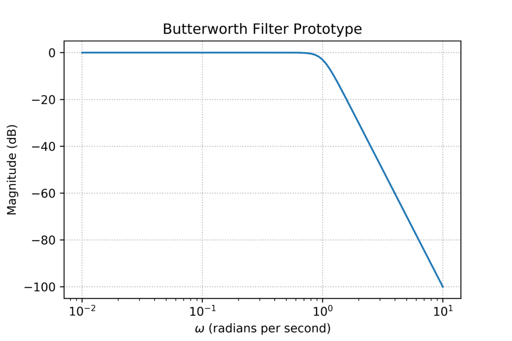
Let’s try to plot the magnitude and phase response of the filter by using the bode function. Note that instead of breaking up the parameters into zeros, poles, and gain (z, p, k), we can just assign a variable ‘f1’ to represent the filter. Though the two are equivalent, this is the required representation for the bode function.
# get the filter zeros, poles, and gain as 'f1'
f1 = signal.buttap(N)

# get the magnitude and phase response using the 'bode' function
w, mag, phase = signal.bode(f1)
The bode function returns three arrays: the frequency array in rad/s, the magnitude array in dB, and the phase array in degrees. We can now plot the magnitude response using the matplotlib library:
from matplotlib import pyplot as plt

# create the figure
fig = plt.figure()

# set the plot title and axis labels
# note that LaTeX symbols are allowed
plt.title('Butterworth Filter Prototype')
plt.xlabel('$\omega$ (radians per second)')
plt.ylabel('Magnitude (dB)')

# add grid lines
plt.grid(which='major', linestyle='dotted')

# plot the magnitude response on a log-scale x-axis but linear y-axis
plt.semilogx(w, mag)

# you can save your plot via the 'savefig' command
plt.savefig('butterworth_mag_sample.png', dpi=600)

# show the plot
plt.show()
This will result in the following plot:
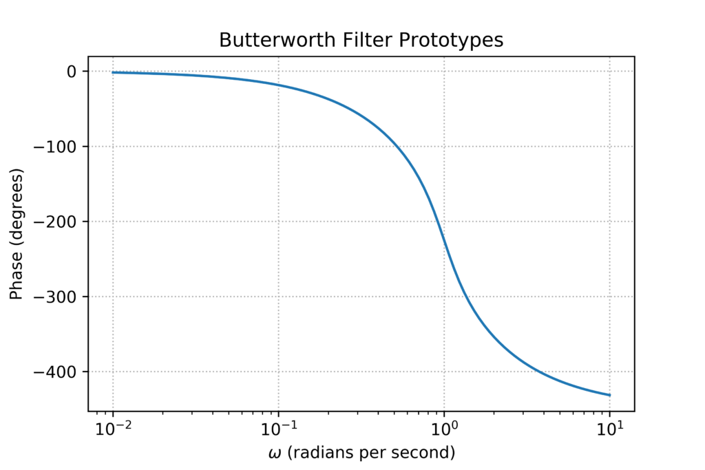
We can use a similar procedure to plot the phase response.
fig = plt.figure()
plt.title('Butterworth Filter Prototypes')
plt.xlabel('$\omega$ (radians per second)')
plt.ylabel('Phase (degrees)')
plt.grid(which='major', linestyle='dotted')
plt.semilogx(w, phase)
plt.savefig('butterworth_phase_sample.png', dpi=600)
plt.show()
This produces the phase response plot below:
Post-Processing Waveform Data
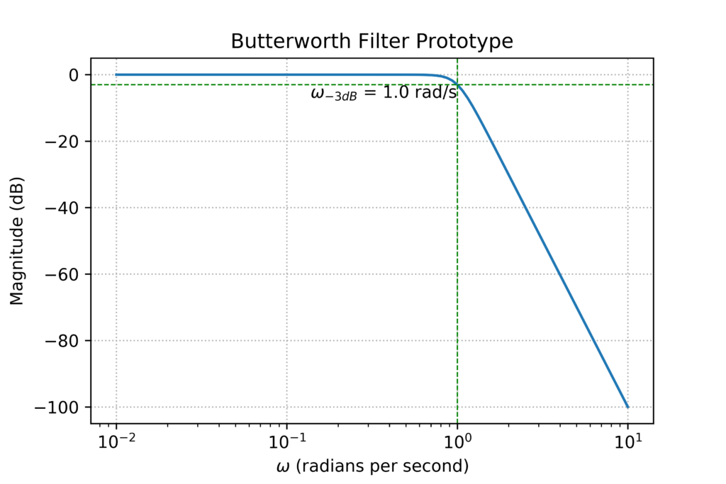
In some cases, we may want to annotate the frequency response plots, or we may just want to obtain specific parameters like the -3dB frequency, or DC gain, or extract the group delay.
A very useful function in python is the ability to search for a value in an array, say, the magnitude response, and return the index of the array value closest to the search value.
# define a function called 'find_nearest'
# arguments: the input array and the search value
# the outputs are the closet array value and its index in the array
import numpy as np

def find_nearest(array, value):
    array = np.asarray(array)
    idx = (np.abs(array - value)).argmin()
    return array[idx], idx
Thus, in our example, we can use this function to find the -3dB frequency of the filter:
# get the index of the magnitude closest to -3dB
mag_nearest, i_nearest = find_nearest(mag, -3)

# the -3dB frequency is then the w at this index
w3dB = w[i_nearest]
You can then use this to information to annotate your graphs. For example:
from scipy import signal
N = 5

f1 = signal.buttap(N)
w, mag, phase = signal.bode(f1)

import numpy as np
def find_nearest(array, value):
    array = np.asarray(array)
    idx = (np.abs(array - value)).argmin()
    return array[idx], idx

mag_nearest, i_nearest = find_nearest(mag, -3)
w3dB = w[i_nearest]

from matplotlib import pyplot as plt

fig = plt.figure()

plt.title('Butterworth Filter Prototype')
plt.xlabel('$\omega$ (radians per second)')
plt.ylabel('Magnitude (dB)')

plt.grid(which='major', linestyle='dotted')

plt.semilogx(w, mag)

# annotate the 3dB frequency
plt.axhline(y=-3, color='green', linewidth=0.75, linestyle='--')
plt.axvline(x=w3dB, color='green', linewidth=0.75, linestyle='--')
text_label = "$\omega_{-3dB}$ = " + str(w3dB) + " rad/s "
plt.text(w3dB, -3, text_label, fontsize=10, color='black', \
         verticalalignment='top', horizontalalignment='right')

plt.savefig('butterworth_mag_sample.png', dpi=600)
plt.show()
This will result in the following plot:
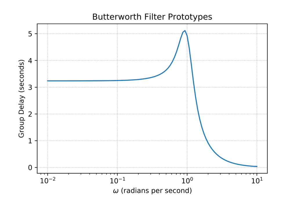
We can also post-process the phase response to get the group delay, using:
# calculate the group delay
# remember to convert degrees to radians
import math
gdelay = -np.gradient(phase*math.pi/180, w)

fig = plt.figure()
plt.title('Butterworth Filter Prototypes')
plt.xlabel('$\omega$ (radians per second)')
plt.ylabel('Group Delay (seconds)')
plt.grid(which='major', linestyle='dotted')
plt.semilogx(w, gdelay)
plt.savefig('butterworth_gdelay_sample.png', dpi=600)
plt.show()
This produces the following plot: